I have been part of the birth of this ministry and have been the sole designer in its branding over the years. 2020 hit and the pandemic gave me and my husband the forced opportunity to give our online resources a huge boost.
Andrew’s work was mostly about being on the road, travelling from one church to another every weekend; when all that ended we had to adapt, like everyone else, and take all his work online.
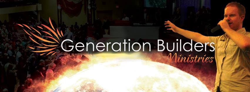
The branding of Generation Builders hadn’t been on the forefront of our minds during the season, we just went with what we had and went hell for leather with getting promotional material and video content up online.
When the turn of 2021 came I decided it was time to simplify and modernise, and as we decided to launch some merchandise it was a good opportunity to look over the whole brand.
What had previously been quite dark, with a hint of colour, just wasn’t what I wanted and it just didn’t get me excited. We knew we didn’t want to do a full logo redesign, just a bit of a tweak and create a more approachable and modern feel. Something that was simpler and less fancy.
The logo was over 10 years old and it was just really dated. And I wanted to get rid of the gradient and bring it into the 21st century….enter 2021 edition…
The new logo was clean, simple, recognisable and modern. It incorporated the same flame as before but by placing it in a circle it just boosted it from dated and boring to usable, adaptable and fresh.
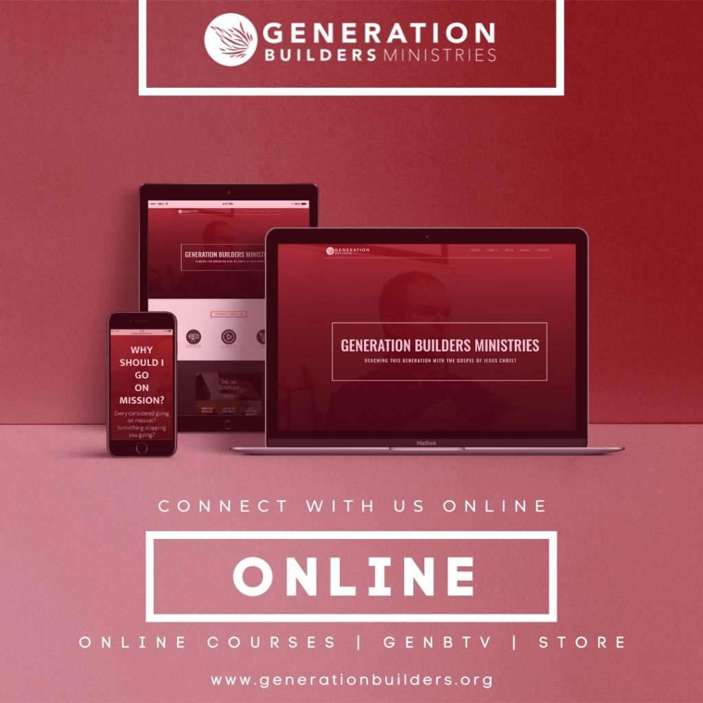
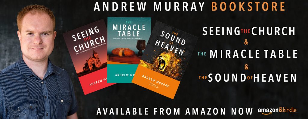
This logo meant a full shift in online graphics, so throughout January & February of 2021 I spent a bulk of time changing the website, social media design and making brand new social media promotions for the new merchandise, Andrew’s books and more.
It was and continues to be a great project to be a part of, it continues to change and grow and adapt with the seasons and times we find ourselves in and it will forever be a great passion of mine.
for more information about Generation Builders visit website

