The New Rubgy Six Nation Logo Rebrand
A Modern Refresh or a Missed Try?
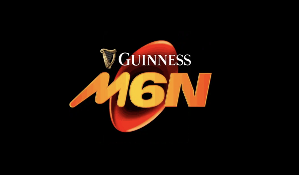
The Six Nations Rugby Championship recently unveiled a new logo for its six nations tournament, rebranded as the M6N (Men’s Six Nations). While the organisation touts the design as a forward-thinking refresh, reactions from fans and critics alike reveal a divided opinion on whether this new identity successfully balances heritage with modernity. As a fan of rugby union, and an understanding about heritage (I come from a rugby union loving family) I have to say that this is probably one of the most controversial rebrands I have seen in a long while.

What’s the vision behind the change?
The rebranding aligns the men’s tournament with the Women’s (W6N) and Under-20s (U6N) tournaments, emphasising unity and consistency across all Six Nations competitions; this I can encourage and love that they’ve seen this importance and I love the fact they’ve brought thought to how the whole rugby community can come together under one brand.
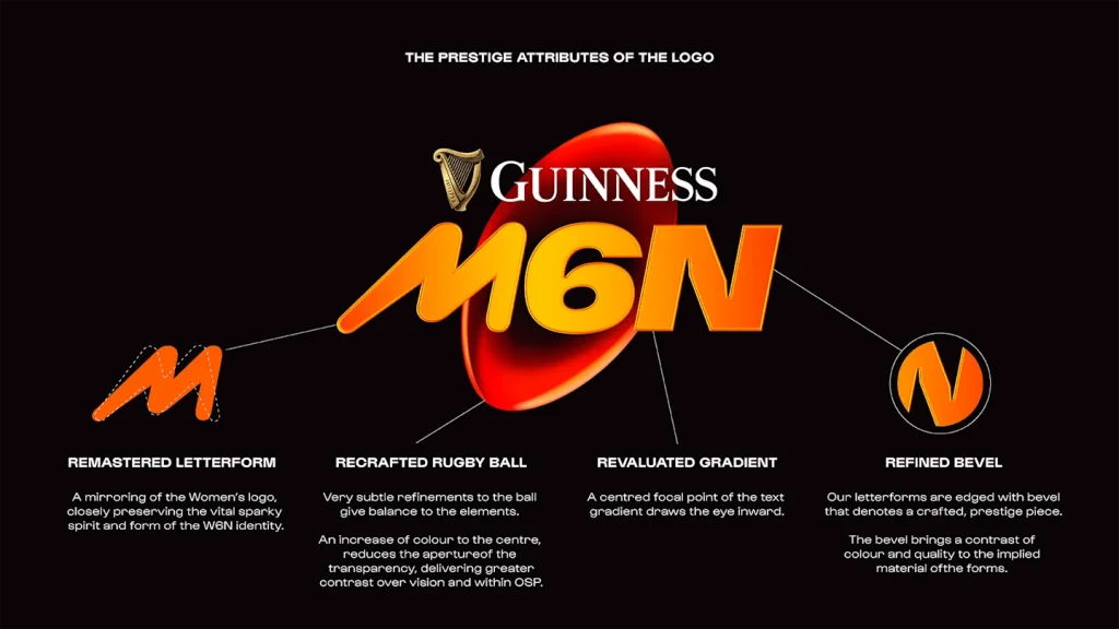
It’s kind of clear to see that the designers involved in this rebrand have chosen to incorporated bespoke chevrons symbolising rugby’s energy and motion, alongside heritage-inspired fonts to honor tradition. The goal seems to be a versatile and recognisable logo that resonates in today’s digital world whilst trying appealing to diverse audiences.

The Public’s Reaction
The unveiling, however, sparked debate. Supporters have praised its clean, modern look and its compatibility with digital platforms. Critics, on the other hand, argued the design lacks the gravitas of its predecessor. Some compared it to Jaguar’s controversial logo redesign, calling it overly simplistic and disconnected from rugby’s rich history.
Fans on social media had plenty to say about the rebrand; “Absolutely shocking”, “terrible” and “the ugliest thing I’ve ever seen” were among the reactions on X, with users comparing it with the branding for a Mars bar, the credits for 1996 film Space Jam and entries into a primary school competition.
“Since it is so steeped in heritage, the old Championship will never be forgotten, but the newly reimagined brand is distinctive, modern and will connect more strongly to new and existing fans, enabling us to tell the incredible new stories in an enhanced way,” the Six Nations said in a statement.
Rob Alderson, editor of Design Week,said the rebrand caught him off-guard, but added that it may age better than fans expect.
The new M6N logo embodies rugby’s attempt to evolve while preserving its roots. Whether it succeeds depends on how effectively the rebrand connects with its intended audiences over time. Ultimately, the controversy reflects the tension between tradition and innovation—a balancing act central to rugby’s future.
So, what do you think? Does the new M6N logo score a try or miss the mark? What ever our thoughts may be, until we see this rebrand in action during the next Six Nation’s Tournament we’ll never truly know.
